
Kelly Hill, chief product officer for , says she spends a lot of time people-watching in Jackson Hole, Wyoming, where the company is based. If she really likes a color combination, she’ll covertly try to take a picture, and Hill is not above stopping strangers on the street to ask about their outfits. She’s trying to spot trends in the field and pick colors for future gear.
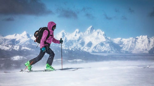
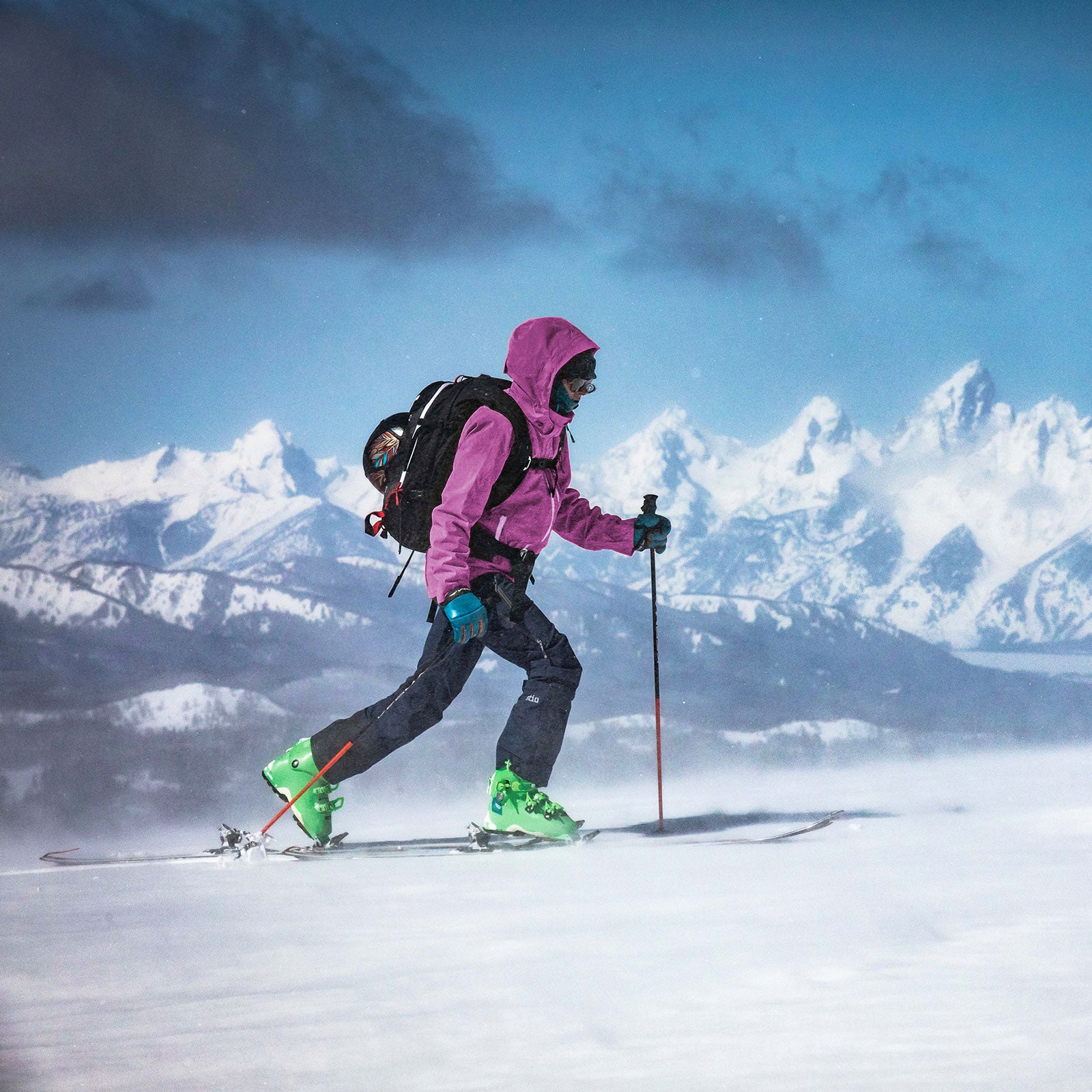
Outerwear is, theoretically, built to last beyond one retail cycle. When you’re investing in a $700 Gore-Tex shell, you want it to look good for a long time, and color is a huge factor in that. It’s emotional—for instance, Hill says most people have a strong opinion about pink—and an important visual flag to mark a new season’s trend. Color is also usually what people look at first when they’re buying something. So, at outerwear brands, employees like Hill who are focused on color are trying to walk the line between hitting trends and designing something that will still be relevant in ten years.
“I’m a fan of involving color,” Hill says. “Blue, for instance, is typically a number one seller. We joke that you can’t break blue, but by adding a little bit of yellow or red, you can help old things feel new again.”
Color is one of the product aspects brands like consider most, says Henrik Andersson, head of innovation and design at the Swedish outdoor apparel and equipment brand. “I’d say it’s a combination of the way the products are designed and how they are colored that’s most important.”
Approximately two years before you see a jacket on the shelf, brands are looking at trend services like , , and , which predict color popularity. Industries from interior design to high fashion use the same services, although they apply them differently, so it isn’t a coincidence when you see multiple brands using a similar shade of olive green or blaze orange. When everyone is starting from the same trend forecasts, brands have to branch out to differentiate themselves.
To do so, they’ll pull in real-life influences, like Hill’s local looks and trends their designers have noticed outside the outerwear sphere. “These could include anything from fine art to low-brow graffiti, science, robotics, movies, and politics,” says Ian Hoffman, senior manager of color design at Arc’teryx.
Brands don’t want to stick with just a safe navy, but they don’t want to end up with a warehouse full of bubblegum ski pants no one wanted.
Andersson says ����ä������ä�����’s designers often go back to their archives to find ways to make old colors feel fresh and to make sure their new products don’t feel totally off-base. He says they consistently use earthy colors like sage green and dark gray to give clues to brand identity.
Color designers are also thinking about both how a piece of apparel will look on the rack at a store or on the internet and how it will hold up in the backcountry, because this stuff is going to be put through the outdoor ringer. “We’re based in a resort town filled with people on vacation or doing leisure activities, so we made a conscious decision early on that black wasn’t going to be a major color,” Hill says. “We try to balance clear tones and earthy ones. We want a jacket to actually live its life in the field, not just be sitting in a closet because it was too crazy of a color.”
That’s where the color planning gets trickier. Brands don’t want to play it too safe with a dull navy, but they don’t want to end up with a warehouse full of bubblegum ski pants no one wanted.
Hill says the kind of product Stio is designing indicates how progressive they’ll take the color. The designers will be more conservative with a ski shell than a midlayer because people will take more of a risk on lower-priced items. “The higher the price point, the more we want to respect longevity,” Hill says. “At a lower price point, we can be more forward thinking.”
Stio uses subtle, familiar colors on new items to ease people in. To hint at trends without fully committing, the brand incorporates pops of trendier colors on zipper pulls or linings of items it wants to last for a long time.
So how weird are things going to get this winter? Andersson says ����ä������ä����� is working on balancing neutrals with bright pops of color like yellow. Hill says Stio’s team is thinking a lot about pairing browns with warmer colors, as well as how they can incorporate trendy patterns like botanicals and camo while making sure their products age well. “Currently, we are really playing with an interesting balance between saturated color and dusty hues,” says Hoffman from Arc’teryx. “I think the industry is getting very good at color. The real gems are going to come up in interesting, less-obvious harmonious pairings.”