

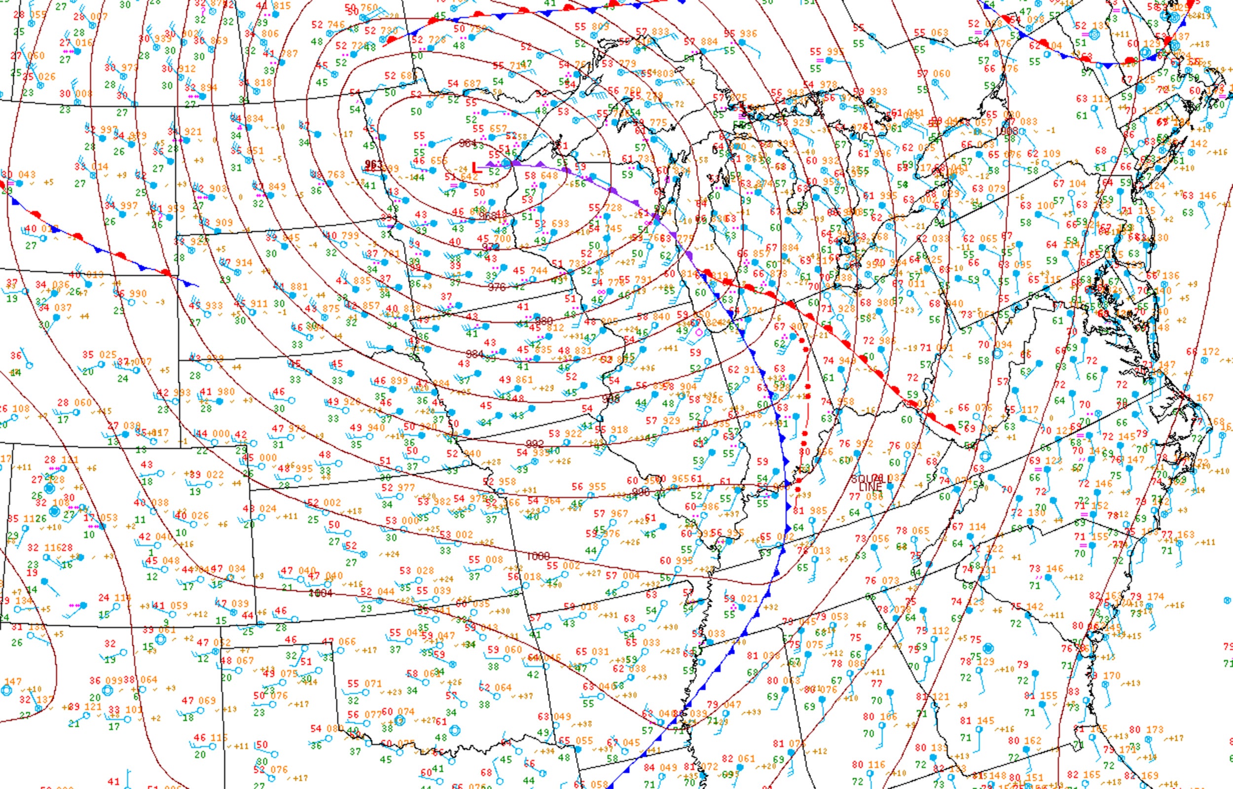
We’re surrounded��by more weather data than we could ever use. Our phones chirp data points at us on command.��Social media is filled with analyses from meteorologists around the world. Even the weather segment on broadcast news turns into a college-level meteorology course when active weather is on the horizon. But��out of all the data we process, an old-fashioned surface map��is still the best way to keep tabs on weather conditions anywhere.
Meteorologists have maps for every occasion, from monitoring a winter storm that’s dumping fresh powder on the slopes to tracking thunderstorms that can crash a camping trip. Most weather maps are dedicated to showing us only one variable, though, like current temperatures or upper-level winds. But it’s the basic surface map, with its��station plots and wind barbs, that reveals��the most information in the quickest way before we��head��outside. Still, detailed surface weather maps are��only as useful as your ability to understand what they’re��telling you. Here’s how to read them.
Station Plots
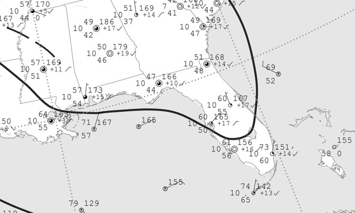
Scientists needed a way to convey��as much information as possible without making a��map completely unreadable. Enter��the station plot, an ingenious way to print lots of information in a tiny space. It��takes a bit of deciphering to understand, but once you’ve got the hang of it, you can get the gist of a specific location’s weather in just a few minutes.��
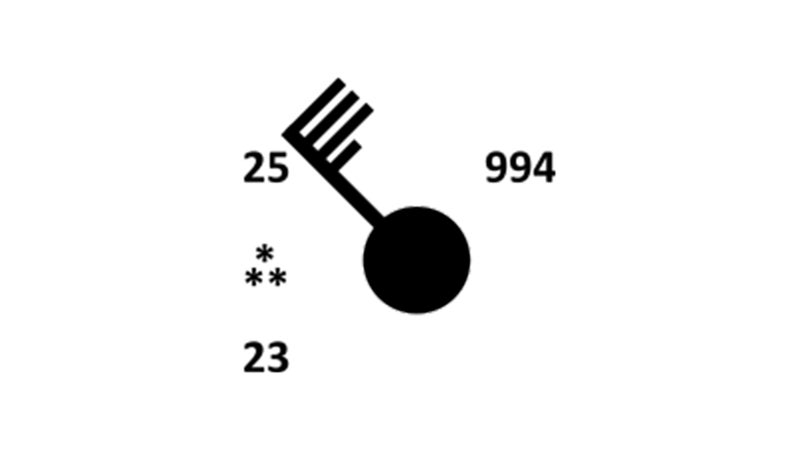
The basic station plot shows temperature, dew point, wind direction, wind speed, cloud cover, precipitation, and air pressure, which are all measured at weather stations around the globe. That’s a tremendous amount of useful information packed into one little graphic—and some maps contain even more data, such as visibility and cloud heights and types.
A station plot always shows the current temperature on the top left, dew point on the bottom left, and air pressure on the top right. The units for temperature and dew point depend on the source that made the map; most surface maps issued in the United States use Fahrenheit, while organizations in most other countries use Celsius.
How to Read Air Pressure
Air-pressure readings are important because they tell you how the atmosphere is moving around you. High pressure fosters calm skies perfect for hiking, while low pressure signals��unsettled conditions and precipitation. Strong winds result from rapid pressure changes over short distances.
Decoding air pressure on weather maps takes memorization and context clues to translate. Most station plots will depict air pressure as a set of three numbers, such as 994 or 112. This number shows the last three digits of a station’s air-pressure reading to the nearest tenth of a millibar (mb); the last number actually comes after the decimal point. For example, 994 would indicate a pressure reading of 999.4 millibars, while 112 would convert to 1011.2 millibars.��(Meteorologists put a nine in front of bigger numbers and a ten in front of smaller numbers.) It’s helpful to keep in mind that it’s rare to see an air pressure higher than 1,040 millibars outside of a deep cold snap. It’s just as uncommon to see an air pressure lower than 980 millibars outside the eye of a hurricane or a nor’easter.
How to Read Wind Barbs: Speed and Direction
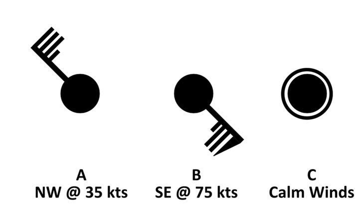
Wind barbs are the most visible portion of a station plot. They tell you the speed and direction of winds at the station. The barb always points in the direction from which the wind is blowing: if the barb points toward the southeast, it means the wind is blowing from the southeast.
A wind barb contains half lines, full��lines, and flags to denote wind speeds. Speeds are always displayed in knots (kts), regardless of the units used for temperatures and dew points. (One knot��approximately equals��1.151 miles per hour.)��A half line represents five��knots, a full line denotes ten��knots, and flags are reserved for increments of 50 knots.
The wind barbs above show winds blowing from the northwest at 35 knots��(plot A) and the southeast at 75 knots��(plot B). If the winds are calm, a thin circle will appear around the station plot (plot C).
How to Read Cloud Cover and Precipitation
A station-plot icon conveys cloud cover by the amount of shading inside the plot’s center dot. A hollow circle indicates clear skies, while a solid circle denotes overcast conditions that could ruin a backpacking trip. Each successive quarter shading of the dot indicates scattered clouds (25 percent filled), partly cloudy (50 percent), and mostly cloudy (75 percent).
Symbols representing precipitation type and intensity will appear directly to the left of a station plot. Solid dots represent rain, while asterisks represent snow, with intensity shown through the use of two symbols (light precipitation), three symbols (moderate precipitation), or four symbols (heavy precipitation). A thunderstorm is denoted by a long arrow in the shape of the letter R.��While these are some of the more common symbols, there are plenty of others for precipitation types, including freezing drizzle and thundersnow.
Pressure Systems and Isobars
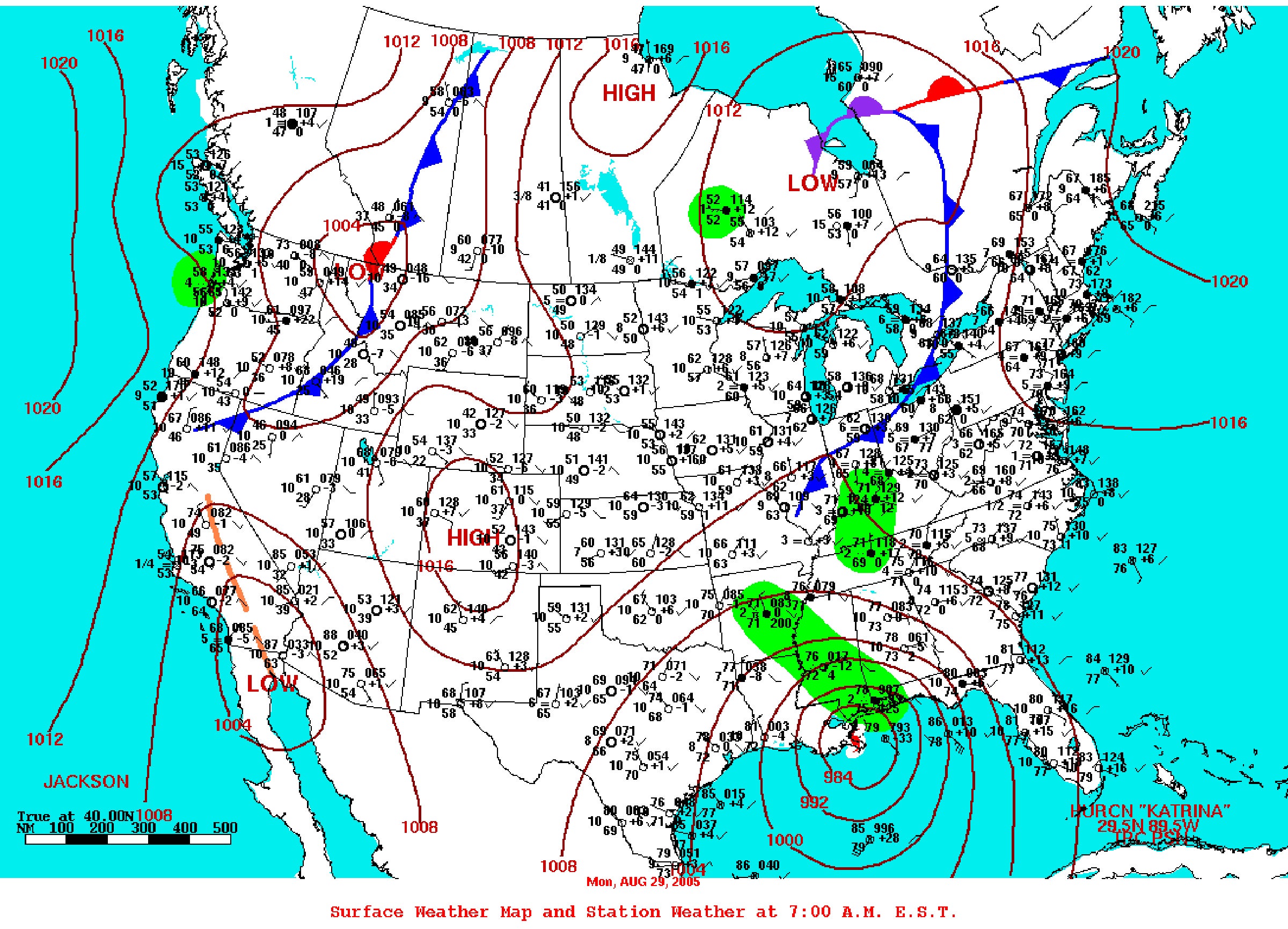
Some surface maps are analyzed by computer programs or human forecasters to add extra information that helps you understand current conditions and predict what’s coming. The most common value-added analyses on surface maps are isobars, pressure systems, and boundaries.
What Isobars Mean
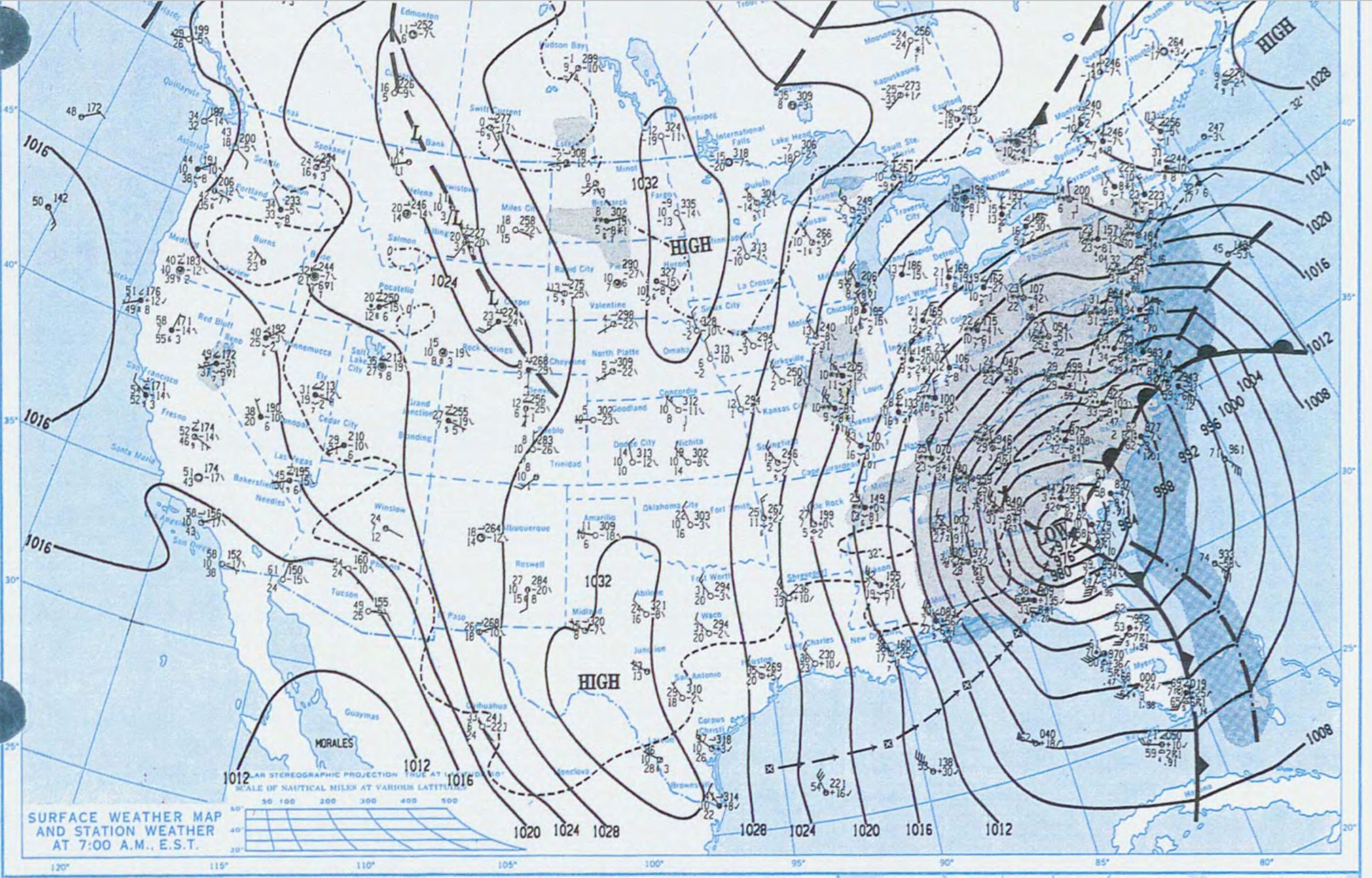
We’re used to seeing a blue H over a high-pressure center and a red L over a low-pressure system. Wind generally blows from areas of high pressure toward areas of low pressure. But even without those letters��printed on the map, it’s usually easy to spot these features using isobars—lines drawn on a map that connect��areas��experiencing��equally high or low air-pressure readings.
These solid concentric��lines��are helpful��for identifying pressure centers and getting a general idea of where it’s windy, making them especially useful for outdoor enthusiasts about to set out on the��next adventure.��Isobars that are closely packed together show greater pressure changes over short distances, indicating rapidly changing weather conditions and gusty winds.
Fronts, Decoded
A front is the boundary between two different air masses; they are ubiquitous on weather forecasts. The difference between the two regions can be subtle or dramatic—a strong cold front, for example, can drop temperatures dozens of degrees in a few minutes.
Cold fronts show cooler, drier air pushing into warmer, more humid air, which can produce powder-day snow. They’re typically shaded blue, with triangular flags pointing in the direction of the front’s forward movement. Warm fronts��exist along the leading edge of warmer, humid air pushing into cooler, drier air. They can sometimes bring stormy weather��and are��usually marked by a��red line with semicircles pointing in the direction of the front’s movement.
A stationary front lies along the edge of cooler and warmer air masses that aren’t advancing toward one another. These are denoted by alternating flags and semicircles��(alternating in the same colors outlined above), each pointing toward their respective air mass.
Occluded fronts are shown in purple on weather maps. An occlusion occurs when cold air overtakes warm air near the center of a low-pressure system, pinching a region of warm air above the earth’s surface. A��“triple point”—where a cold front, warm front, and occluded front meet—can sometimes serve as the focus for severe thunderstorms, which may ruin an afternoon run.
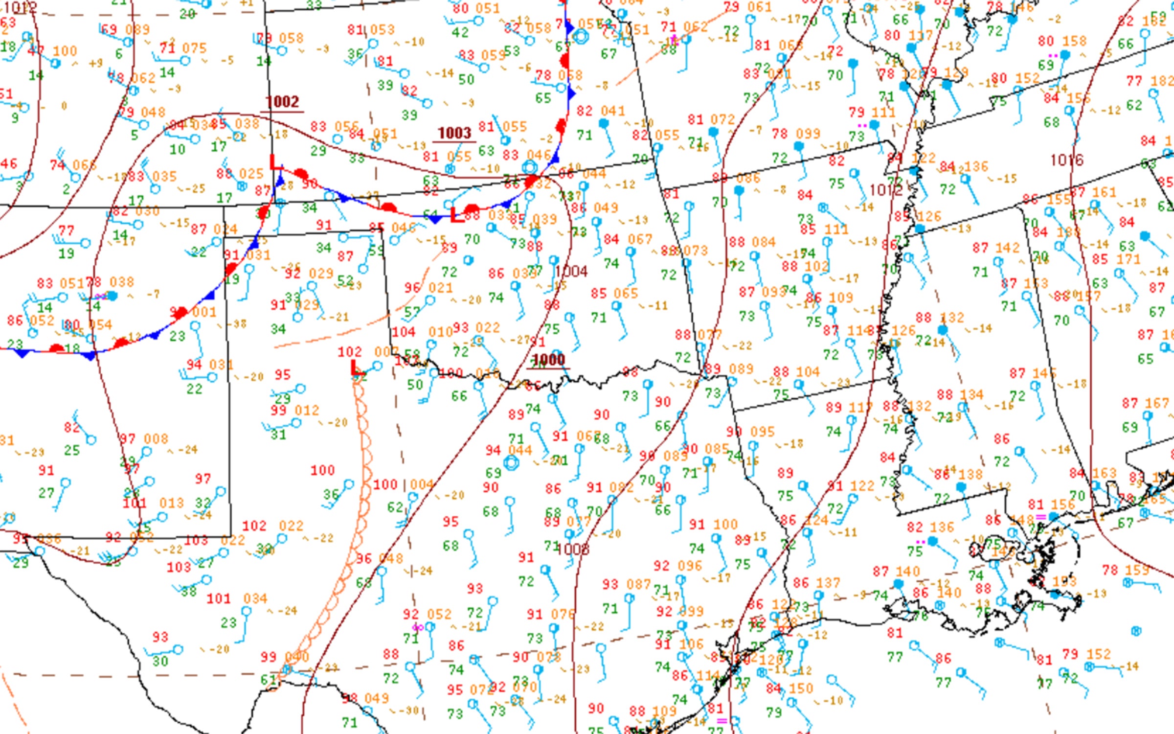
Dry lines, depicted on surface maps in beige, with hollow semicircles pointing in the direction of movement, are a type of front typically only seen��on the southern plains. They’re a dividing line between humid air flowing in from the Gulf of Mexico and extremely dry air from the desert region out west. A dry line moves eastward in big leaps during the afternoon as a result of daytime heating. These fronts can serve as the catalyst for intense springtime tornado outbreaks in Texas and Oklahoma.
Resources
With these basics in mind, the best place to download reliable, up-to-date weather maps is��the U.S. National Weather Service—just make sure you save them to your phone or bookmark the direct link in your phone’s browser before you head out. The agency’s products are free for public use, and the entire organization only costs each taxpayer a little more than a dollar a year. Various branches of the NWS issue a multitude of surface maps covering the United States. The ��mostly handles everyday weather, like fronts and temperatures, while the����handles severe thunderstorms and fire-weather outlooks.��The offers detailed analyses of weather across the Atlantic, Pacific, and Arctic Oceans.
International weather organizations also provide fantastic services for their coverage areas, including , the UK’s , and Australia’s . Private companies and academic institutions also issue weather maps, such as the College of DuPage’s .